The Results Are In - Five Winners!
1, 2, 3, 4, 5 Silver Medals in the Harpers Design Awards 2023...
We are proud to have an in-house Design Team to create bespoke wine lists, brochures and other marketing materials.
Our Senior Graphic Designer, Maria Blackstone is dedicated to creating packaging for new exclusive products sourced by our Buying Team, as well as refreshing old label designs that are in need of an update. Having control over the sourcing and packaging of some of our products can help us to maintain price, quality and ensure sustainability is high on the agenda. These are often shipped in bulk, meaning lighter-weight shipments that are bottled here in the UK.
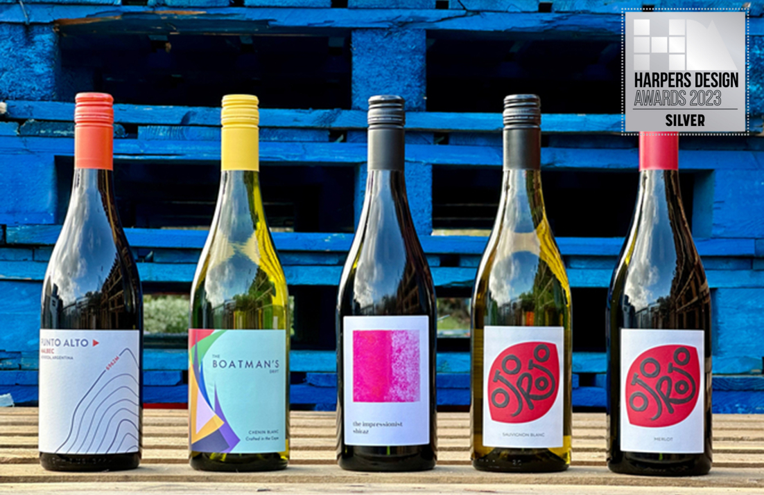
Following our three silver medal wins last year with Harpers Design Awards, we are proud to announce that we have continued our success in 2023, winning another five silver medals for a range of our in-house products, both new and established. Our winning designs are for: Punto Alto Malbec, Boatman’s Drift Chenin Blanc, Ojo Rojo Sauvignon Blanc and Ojo Rojo Merlot and The Impressionist Shiraz.
I am ever so proud to win more medals for my designs and it feels like a great achievement to be sat alongside design agencies who continually inspire me. I’m excited to continue to work on some more creative brands next year, and create some more award-winning design!
Here is an insight from Maria, on how she goes about the label design process and a bit of background on the story of these labels.
"No two projects are alike of course but there are a few techniques I find work well for me when I embark on a label design. Firstly, I’ll brainstorm around the name of the wine or, if that is still to be decided, look into cultural or geographical elements which might spark some ideas. I will create some visual mood boards for a few different concepts and make some rough sketches. This then gives me an idea of which ones might be worth pursuing further.
Once a few ideas begin to crystallise, I develop the graphic elements in tandem with potential typefaces. The typeface can reflect and complement the design concept and in many cases add a significant amount of character and impact to the design. Once a handful of concepts are worked up, it is time for them to see the light of day as I present them to the team for discussion and feedback. Once our chosen route is decided, it is time to refine the design and prepare it for print, including thinking about paper stocks, special finishes and capsule colours."
The concept behind each wine label design:
Punto Alto Malbec
Punto Alto, meaning High Point, was inspired by the south face of Aconcagua, the highest peak in South America, at 6,962 metres above sea level. Part of the Andes mountain range, Aconcagua is the second highest of the Seven Summits (the highest peaks on each continent), only behind Mount Everest in Asia. It is within this area, that much of Argentina’s Malbec is grown. The warm days and cool nights allow grapes to ripen slowly bringing freshness and purity of fruit to the resulting wines. Probably the best-known region to benefit from this high-altitude phenomena is Mendoza, where this premium wine originates from.
The visual direction was inspired by the contour lines found on maps, to reference elevation. Some of the elevation lines were embossed, giving a raised effect similar to that of mountainous ranges. The blue colour was inspired by the snowy blue mountainous peaks and paired with a contrasting bright orange to allow details to pop.
Boatman’s Drift Chenin Blanc
This label had a redesign, where the original label’s concept was based on an 18th century legend, so it needed to be brought up to date and given a more contemporary, fresh look.
The new concept was based around the energy and vibrancy at a boating race or regatta. Lots of coloured sails, energetic crowds, passion from competitors and healthy competition. Simple graphic shapes were used to represent the sails on a sea. A sans serif typeface was used to complement the triangular, graphic shapes of the sails. To complete the design, a matching capsule for a burst of colour.
Ojo Rojo Sauvignon Blanc & Merlot
The design was inspired by the brand name, Ojo Rojo meaning 'Red Eye'. A custom wordmark was created to fit into the eye shape after looking at brushstrokes created by ink and brushes. A bright, but deep and earthy red was used along with a matching red capsule for the Merlot and a black capsule to match the type lockup for the Sauvignon Blanc. To add depth to the design, a high build matte varnish was used on the type lockup.
The Impressionist Shiraz
Inspired by Lake Bumbunga, located in Lochiel, South Australia, the salt lake is known to change colour from pink, to white, to blue, depending on the salinity of the water throughout the year. At times of high-salinity, algae produces beta-carotene pigment, which has the effect of making the lake look pink. Lake Bumbunga is made up of three salt pans, with its name reportedly derived from the local indigenous, Parnpangka people's term for 'rain water lake'. The artwork was created using sea salt and watercolours to reference the salt pans - watch the design process for this label on our Instagram account.
Congratulations to Maria on another successful year of entries!
